Perez, Perez & Perez
A New Jersey family law firm gets a bilingual presence built to earn trust the moment a worried family lands on the page.
The Background
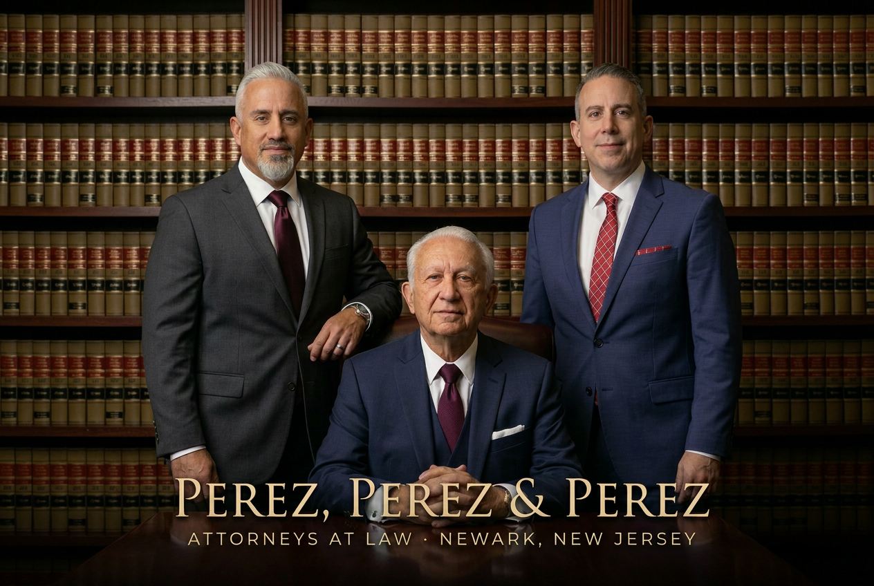
Perez, Perez & Perez is a family-run New Jersey law firm focused on immigration and estate planning — the two areas of practice where the stakes are most personal. Removal defense, green cards, citizenship, wills, trusts, and the long quiet work of keeping families together and protected. The firm had built a reputation by word of mouth across the Spanish-speaking community, but the website didn't reflect any of it.
The previous site was a generic template — stock gavel imagery, dense paragraphs of legalese, no Spanish version, and no clear path for a scared client to reach an attorney. People who needed help most were bouncing off the homepage before they got to the phone number.
The brief: build a bilingual site that feels like the firm itself — steady, human, and honest — and make it absurdly easy for a family to ask for help in the language they actually speak at home.
Who It's For
Primary: Immigrant families across New Jersey navigating removal proceedings, green-card applications, and citizenship — often under real time pressure and real fear. Many search in Spanish first.
Secondary: Adult children helping aging parents put an estate plan in place — wills, powers of attorney, healthcare directives, and trusts that protect a lifetime of work.
The mindset: They're not shopping for a lawyer the way they shop for a contractor. They want to know — in the first ten seconds — that the firm is real, that the firm has done this before, and that someone will pick up the phone in the language they're most comfortable in.
Discovery
Sat down with the attorneys and walked through the actual intake — what clients ask on the first call, what they're afraid of, what makes them choose one firm over another. A few things came out clearly:
- Most calls start in Spanish. A site that only spoke English was filtering out the firm's strongest fit.
- Trust is the entire product. Headshots, real reviews, a clear physical office, and a phone number that rings — not a chatbot.
- Immigration clients and estate clients want different things, and the homepage was making both groups work too hard to find their path.
- The Newark Immigration Court draws searches from across the state. There was real organic upside in writing for it directly.
Audited a dozen competing firms in the region. Almost all of them looked the same — navy and gold, columns and gavels, no Spanish version, no warmth.
Strategy & Information Architecture
Built a fully bilingual site — not a Google Translate widget, but two parallel route trees with hand-written Spanish copy, mirrored navigation, and an obvious language toggle in the header.
- Home — a calm hero, the two practice areas front and center, attorney faces, and reviews in both languages.
- Immigration — removal defense, family-based petitions, citizenship, with plain-language explanations of what each process actually looks like.
- Estate Planning — wills, trusts, powers of attorney, and the conversation about what happens next.
- Attorneys — every attorney with a real photo, real bio, and the languages they speak.
- Reviews — curated client testimonials, presented in their original language.
- FAQ — the questions clients actually ask before they call.
- Newark Immigration Court Guide — a long-form resource page written for the search term, not the firm.
- Consultation request — a short, dignified form that ends with a phone call back, not a sales sequence.
Every page got distinct meta titles and descriptions tuned for both English and Spanish searches — "immigration lawyer New Jersey," "abogado de inmigración Newark," "estate planning attorney NJ."
Brand & Visual Direction
Law firm sites tend to default to one of two looks: heavy and old-world (mahogany, scales of justice, sepia photos of the founder) or sterile-corporate (stock skylines, generic blue gradients). Neither fit. Perez, Perez & Perez is a working family firm in 2026, not a 19th-century chambers.
- Palette: Deep navy with a warm ivory background and a single restrained gold accent. The navy reads as serious; the ivory keeps the page from feeling oppressive on the day someone is reading it through tears.
- Typography: A confident serif for headlines that signals tradition and care, paired with a modern sans for body copy that keeps long passages legible on a phone.
- Photography: Real attorney portraits, real office, real team. No stock lawyers shaking hands in front of a window.
- Layout: Generous whitespace, calm motion, and an obvious "Call (973) 522-1222" next to every consultation button on the site.
Copywriting
The voice is warm, clear, and never condescending. "Passion, empathy, and honesty drive our entire legal team as we help our neighbors remain with the people we love." That line set the tone for the rest — the firm talks about clients as neighbors, not cases.
Every page was written twice — once in English, once in Spanish — by someone who speaks both. Not translated. The Spanish site doesn't read like a translation, and the English site doesn't condescend to a bilingual reader. The FAQ answers the questions families actually ask before they call: what happens at the first hearing, how long a case takes, whether a consultation costs anything, what to bring.
Build
Built on a modern React stack with server-rendered pages for SEO, sub-second first paint, and a routing layer that handles the bilingual structure cleanly.
- Fully bilingual route tree — separate English and Spanish routes (
/immigration↔/es/inmigracion,/estate-planning↔/es/planificacion-patrimonial) with a language toggle that preserves the page you're on. - Tap-to-call everywhere — every consultation CTA on the site is paired with a
tel:button so a phone tap opens the dialer with the number pre-filled. The site never asks a worried family to copy down a number. - Consultation form — short, accessible, and routed straight into the firm's inbox with the source page attached, so the team knows whether the lead came from the immigration page or the estate page.
- Local SEO foundation — schema.org markup for the firm, every attorney, and every practice area, plus a long-form Newark Immigration Court guide written for the search term.
- Performance — image preloading on the hero, lazy loading everywhere else, and a clean Lighthouse score on a three-year-old Android.
Launch & Handoff
Connected the custom domain, provisioned SSL on both the apex and wwwsubdomain (after debugging a real-world Google Business Profile redirect issue), verified the site in Google Search Console, and submitted both the English and Spanish sitemaps.
Wrote a short owner's guide covering how to add a new attorney, update office hours, and publish a new testimonial in both languages. The firm never has to touch code.
Ongoing maintenance plan: hosting, security patches, content updates, and the inevitable real-world adjustments — new attorneys, new practice areas, new jurisdictions.
What I'd Highlight
- A fully bilingual site that ranks for both English and Spanish search terms across New Jersey — "immigration lawyer NJ" and "abogado de inmigración Newark" alike.
- A consultation flow that turns a hesitant first visit into a phone call: tap-to-call on every CTA, a short form for after hours, and no dark patterns.
- A brand identity that reads as steady and human — the kind of firm a worried family feels safe handing a hard problem to.
- A long-form Newark Immigration Court guide that pulls in organic traffic the firm wasn't getting before and converts it into intake calls.
- A retainer relationship, not a one-and-done — the site grows with the practice.
What it taught us
The hardest part of this project wasn't the design — it was the bilingual structure. A "translation" button is not bilingual. Real bilingual means two parallel route trees, two sets of meta tags, two sitemaps, two voices, and a toggle that remembers where you were. Cutting that corner would have undone the entire premise of the site.
The other lesson was restraint. A law firm site is read on the worst day of someone's year. It doesn't need a parallax hero or a custom cursor — it needs a real phone number, real faces, and copy that doesn't make a scared person feel smaller. Every decision was filtered through that.
Your project, next.
Designed, built, and shipped in about four weeks.